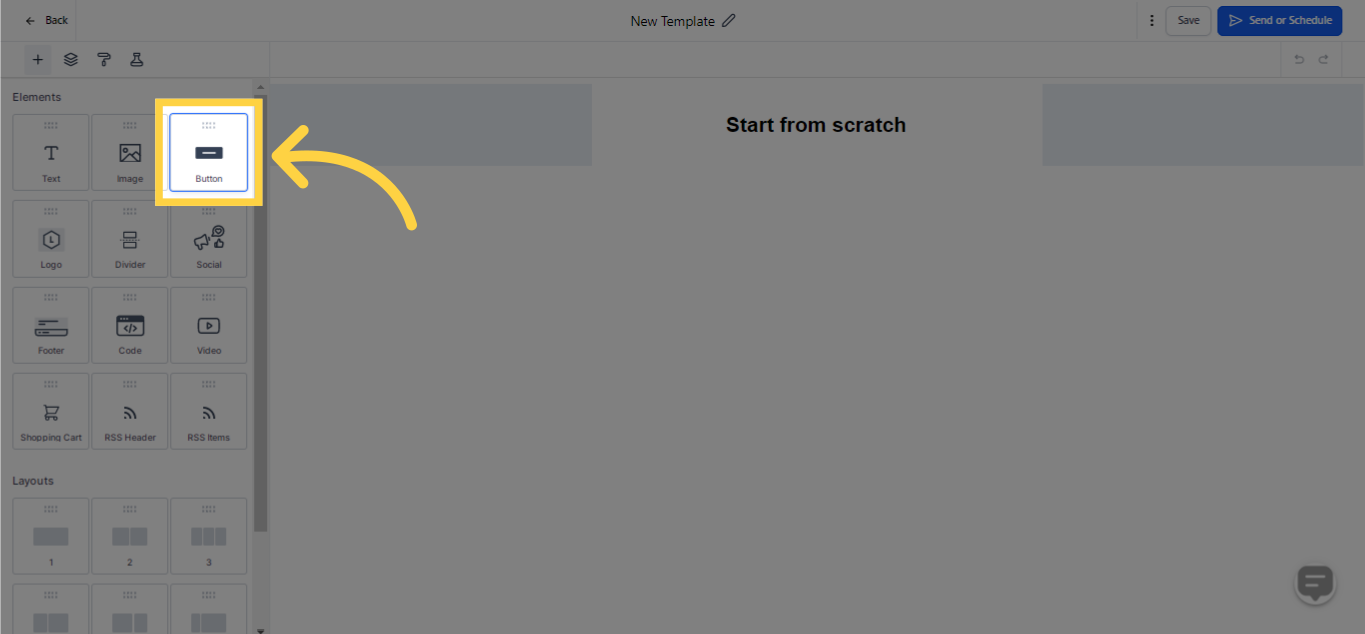
Research has indicated that the inclusion of a Call-to-Action (CTA) button in your emails significantly enhances the conversion ratio. The Customer Relationship Management (CRM) system enables you to insert a clickable CTA button within your email, which points to a targeted URL.
This utility offers you the capacity to prompt your audience toward specific actions, be it visiting your website, procuring a resource, or completing a purchase. Take advantage of this tool to foster recipient engagement and propel your email advertising campaigns towards triumphant outcomes.
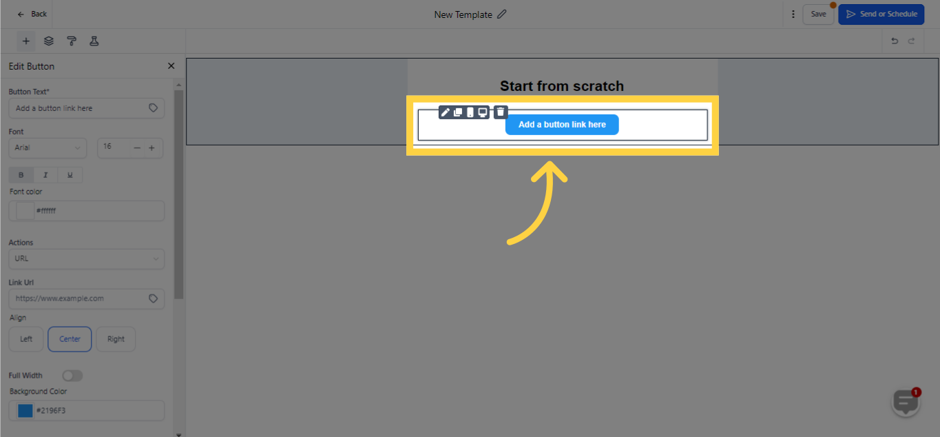
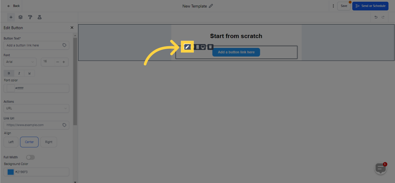
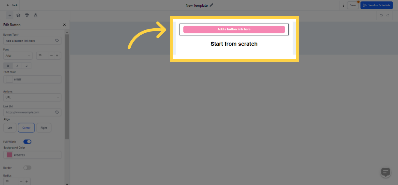
To fine-tune the button element, simply click on the pencil icon to access the edit settings. Begin by inputting the text you want on the button. The font style can be tailored to suit your preferences; select the font type, size, and decide whether to bold, italicize, or underline the text as per your needs.
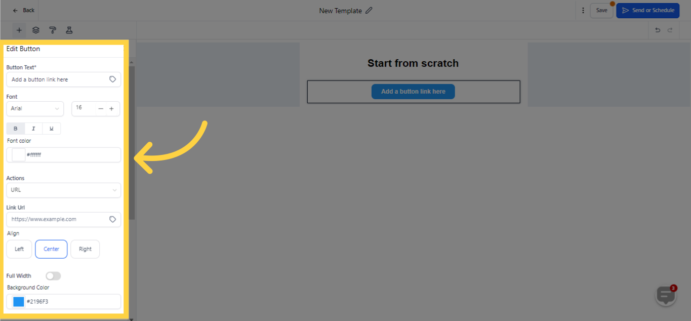
Adjust the button's action from the available dropdown menu, wherein options like URL, mail, file, telephone or others can be selected, followed by filling in the corresponding information. Align your button to your preferred side, be it left, right, or center, using the alignment dropdown. It's possible to make your button span across the entire email's width by toggling the option on.
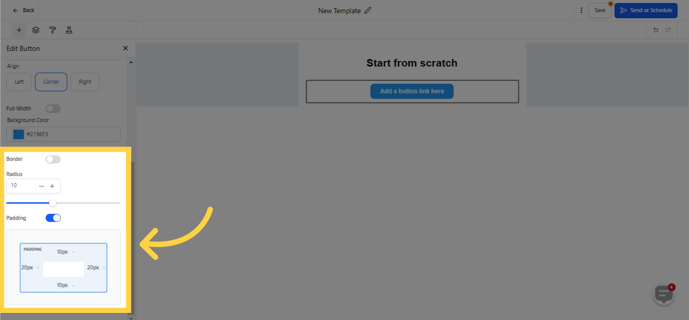
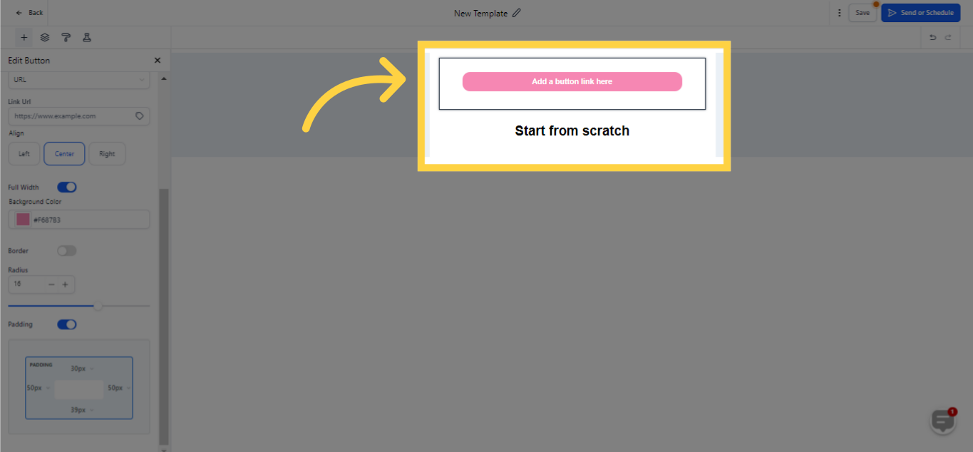
Spotlight your button by selecting a vibrant color from the color picker options. If none of the pre-determined colors resonate with you, head over to the 'advanced' setting to input your desired custom color code. Modify the radius around your button either manually or by sliding the radius adjuster to create a button that precisely meets your design need.
)
Finally, tweak the padding surrounding your button, with customizable settings for the top, bottom, left, and right, ensuring the button aligns splendidly within your email.
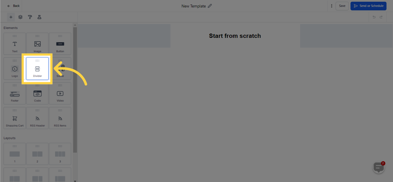
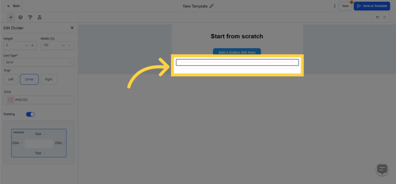
Should you wish for an effective way to segment text, images, and buttons, employing dividers can be incredibly beneficial! Not only do they enhance your design's cohesiveness, but they also underpin individual elements, amplifying their impact. Moreover, dividers serve to demarcate and establish boundaries for the various segments of your page, greatly assisting readers in the effortless gathering of information.
)
The Divider element enables you to smoothly create distinctions within your email content. To utilize it, just drag and drop this component right under the preceding section in your email editing tool. By integrating dividers, you'll be constructing an eye-catching and well-structured email formation that bolsters legibility and guarantees your content gets across to recipients with better clarity.
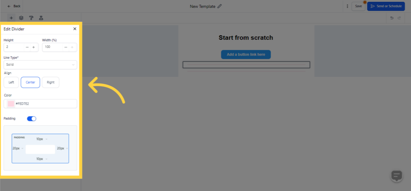
Adapt the padding surrounding your divider to render its positioning perfect to your taste, by augmenting or diminishing the padding as per your preference.
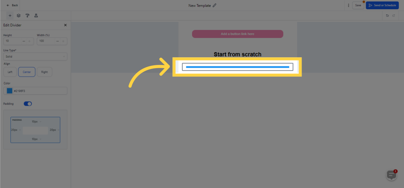)
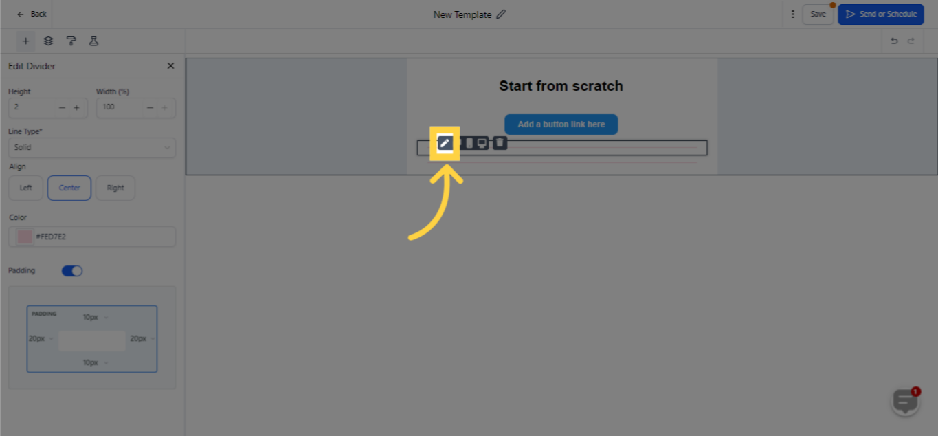
After integrating the divider element, several customization options can be accessed by clicking on the pencil icon within the Divider component. This facilitates fine-tuning the line height and width, as well as calibrating its alignment as needed. Beyond this, you can modify the line style from solid (the default setting), to dashed or dotted for enhanced visibility. Moreover, you can choose from a range of colors to make it visually more attractive.

)
)